


Instapaper for Android

Introducing Instapaper for Android.
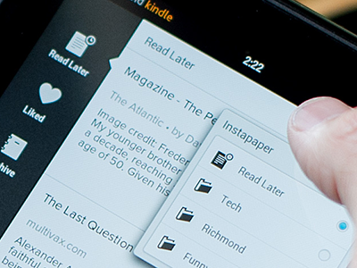
While I take no credit for the icon shapes or standard navigation concept this was a major design project to tackle. Assets had to be created for both light and dark modes for each of its states (that were different between tablets and phones) and then finely adjusted for three screen resolutions. That means every icon asset could have up to 36 permutations. Then there was the matter of completely custom popovers, trays and standard chrome elements. Needless to say I got pretty good at making sprite sheets. All in all this was an eye-opening project and I can't wait to get to work making it even better.
Check it out at http://instapaper.mobelux.com.


