


Teeslocker

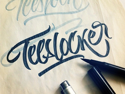
Making a t-shirt lettering for a seller from Hong Kong and just noticed that I wrote it incorrect with unwanted "S". It must be written as Teelocker. What a pity:)
Written with Tombow brush pen and Copic multiliner 0.25 mm
Making a t-shirt lettering for a seller from Hong Kong and just noticed that I wrote it incorrect with unwanted "S". It must be written as Teelocker. What a pity:)
Written with Tombow brush pen and Copic multiliner 0.25 mm


