Find designers
Designer search
Quickly find your next designer
Post a job
The #1 job board for design talent
Inspiration
Courses
UX Diploma
Learn UX design from scratch in 6 months
UI Certificate
12-week UI skill building for designers
Live interactive workshops
with design professionals
Jobs
Go Pro
Log in
Dribbble: the community for graphic design
Log in
Sign up
on:hover
James
Available for work
Follow
Following
Like
Get in touch
#FFFFFF
#959DAA
#B6BBC4
#6F7888
#353535
Download color palette
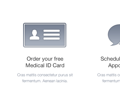
Psst. I've still to play with the rounded corners...
design
gif
ui
ux
View all tags
Posted on Jun 3, 2012
2,428
3
76
4
View feedback
James
Designer at Wireframe Design Studio
Get in touch
More by James
View profile
Previous
Next
Loading…
Loading…
Loading…