'Le Menu'

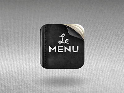
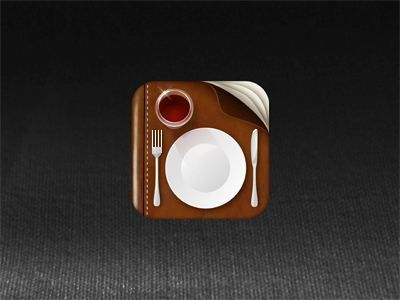
Well, quick directional shift... Client decided to scale back on most of the details in the initial...but we kept the base, and went black / typographic instead.
I am going to miss that little wine glass...but I'll just have find a way to sneak him in somewhere else ;)
**UPDATE** Confirmed final icon