Find designers
Designer search
Quickly find your next designer
Post a job
The #1 job board for design talent
Inspiration
Courses
UX Diploma
Learn UX design from scratch in 6 months
UI Certificate
12-week UI skill building for designers
Live interactive workshops
with design professionals
Jobs
Go Pro
Log in
Dribbble: the community for graphic design
Advance your career with a Professional Diploma in UX Design
Learn more
Log in
Sign up
Queue
Jan Vu Nam
Available for work
Follow
Following
Like
Get in touch
#FCF6F1
#F3D9B9
#D7764C
#AA9D91
#DD9F6C
#D1B595
#3C3D45
#75798D
Download color palette
homepage
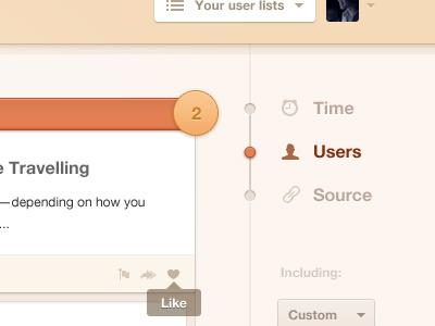
queue
sorting
ui
web
View all tags
Posted on Jun 2, 2012
17,108
47
388
17
View feedback
Jan Vu Nam
Get in touch
More by Jan Vu Nam
View profile
Previous
Next
Loading…
Loading…
Loading…