Find designers
Designer search
Quickly find your next designer
Post a job
The #1 job board for design talent
Inspiration
Courses
UX Diploma
Learn UX design from scratch in 6 months
UI Certificate
12-week UI skill building for designers
Live interactive workshops
with design professionals
Jobs
Go Pro
Log in
Dribbble: the community for graphic design
Log in
Sign up
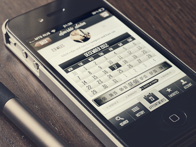
Appointment time & date selector
Vadim Sherbakov
Available for work
Follow
Following
Like
Get in touch
#48393A
#E4E3D2
#282934
#615958
#BEB6A6
#90857B
Download color palette
Appointment app time and date selector screen.
Bigger picture in attachment.
appointment
chocolate
dark
date
design
ibooksmart
interface
iphone
retina
selector
time
ui
ux
View all tags
Posted on May 31, 2012
8,590
28
136
11
View feedback
Vadim Sherbakov
Get in touch
More by Vadim Sherbakov
View profile
Previous
Next
Loading…
Loading…
Loading…