Updated punch clock icon

21 Responses

  1. Pro Yummygum Yummygum

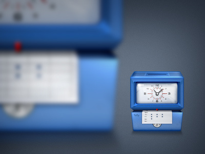
    Added a rougher texture without making the icon look muddy. Thanks again for that suggestion on the previous shot guys!

    Also did some more work on the glass and numbers. Please Check out the attached image to see a side by side comparison.

    12 months ago

  2. Pro Thom Thom

    NICE! de texture maakt het zeker weten af! :D

    likes

    12 months ago

  3. Pro Kevin Anderson Kevin Anderson

    Thumbs up!

    likes

    12 months ago

  4. Pro Anders Drage Anders Drage

    On the smaller one, the clock seems like a "check" sign, like in the to-do lists.. It gives me the wrong idea of what it is I guess?

    likes

    12 months ago

  5. Pro Leon Bolwerk Leon Bolwerk

    Awesiousness!

    12 months ago

  6. Pro Jip Jip

    Amazing work guys!

    12 months ago

  7. ThisIsUI ThisIsUI

    Lick the screeeeeeen :P

    likes

    12 months ago

  8. Pro Max Steenbergen Max Steenbergen

    Much better guys. Especially digging the subtle reflection on the glass. Now, this is a bit nitpicking but maybe the sheet of paper makes a too sharp fold. I'd try making the fold a bit "rounder", if you know what I mean.

    likes

    12 months ago

  9. Pro Hidde van der Ploeg Hidde van der Ploeg

    Lekker bezig!

    likes

    12 months ago

  10. Pro Fares Farhan Fares Farhan

    What @Hidde van der Ploeg said ^

    likes

    12 months ago

  11. Pro Marvin Kennis Marvin Kennis

    Nice! The reflection on the glass is great, even though the shine in the top left corner of the glass has a bit of an odd shape

    likes

    12 months ago

  12. Naseem Naseem

    Insane work

    likes

    12 months ago

  13. Pro Yummygum Yummygum

    Thanks guys, the feedback we got was really helpful.

    @Max Steenbergen I see what you mean, especially on the 512 version. We're not too bothered by it though so we think we'll leave it as it is. But definitely a good pointer for future icons that involve pieces of paper, thanks!

    @Anders Drage First it was just a funny result of the scaling, but then we noticed it look like a tick which we think actually looks nice, so we decided to leave it (naturally after enhancing the pixels to appear sharp after down scaling)

    @Jip @Thom @Fares Farhan @Hidde van der Ploeg thanks guys!

    @Marvin Kennis Ah yeah, we see what you mean. Thanks for pointing it out. It was already there in the previous version, but we guess it's more noticeable now that the inner shadow/glow on the glass is stronger than previous version. We kinda like the definition it gives the glass.

    likes

    12 months ago

  14. Jesper van Haaren Jesper van Haaren

    Such a beautiful icon. The amount of details is great, colors are great, textures are great, the whole damn thing is just great!

    12 months ago

  15. Andrey S. Rodrigues ☝ Andrey S. Rodrigues ☝

    really better, I loved the reflections!

    likes

    12 months ago

  16. Jamie Marciano Jamie Marciano

    Only thing it needs now is to make the paper more like a card :p

    12 months ago

  17. Pro Sai Nihas Sai Nihas

    This is awesome especially the reflections.

    12 months ago

  18. Pro Tanveer Junayed  Tanveer Junayed 

    Nice work @Yummygum

    likes

    12 months ago

  19. Josh Rufer Josh Rufer

    I love the new detail, especially on the glass.

    12 months ago

  20. Pro Gert Jan Lodder / Pixellod Gert Jan Lodder / Pixellod

    Over Russen gesproken ;) Gaat lekker daar in A'dam! Great job, guys!

    12 months ago

  21. Pro Yummygum Yummygum

    Thanks a lot!

    @Gert Jan Lodder Haha, dat is een groot compliment, thanks!
    @Jamie Marciano Hehe, we did consider it

    12 months ago

keyboard shortcuts: previous shot next shot L or F like