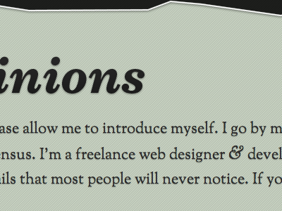
Legible Test For Goudy
I increased the size here up to 22px and then noticed the smoothing was the cause of some aliasing within Safari as Chrome wasn't see the same problems. Turns out, I had 'Windows Default' chosen for smoothing and having turned it to 'Light', the text is now looking more like it does in Chrome. I like the slightly larger introduction anyway and it ensures the ampersand is given ample room!
More by Dave McNally View profile
Like


