Annie Hayes Wellness

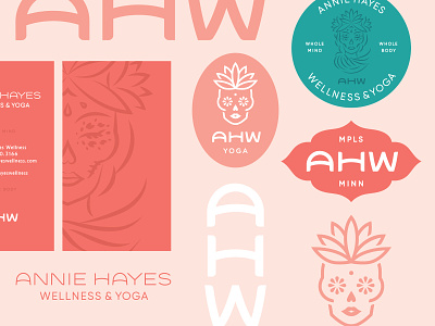


This project was a challenge in that I had to tie two kinds of sugar skulls into one brand, alongside a monogram and logotype that all felt like the same family. The more detailed skull become a textural element while the simpler skull became a glyph / favicon / icon element. Annie wanted to focus on sugar skulls to channel her personality and make her brand stand apart from other yoga brands, while still feeling like it could belong to the yoga industry. Check out the attachments for more context. Full project here


