Home to Work Chart

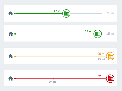
Given a preferred distance from home (25 mi), this simple chart visualizes how well the actual distance to work matches up. This would likely be included in a profile for a potential job match scenario.
Even better than using distance would be time travelled, but that'd be dependent on development concerns and business rules.


