Task Manager

I've been working on a design for a simple and intuitive task manager, that isn't too heavy and cumbersome, but has a few more features than say a, Clear App. Though I love it, I feel it's missing a couple key features necessary for a really useful productivity app... but damn is it beautiful.
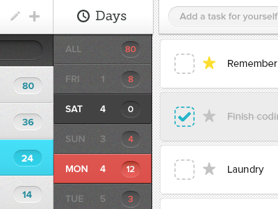
Here I'm showing the different states of the interface elements. The left column (lists) shows the regular states, and the active state (blue) of the list you're currently viewing, while the darker, middle column is the day of the week. The dark grey is the rollover, and the red is the active day. If the image wasn't cropped, you'd see a list for "Chores", due Monday the 4th.
The items on the right are then the items within that to-do list. The top item shows a favorited/important item (which is positioned at the top of the list). The second grayed-out item shows a completed task, and the item below it is the regular state.


