Hooters Rebrand

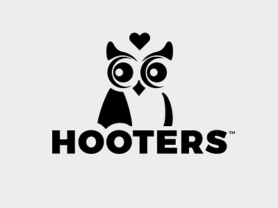


Owl in love logo for the Hooters restaurant chain. I injected some fun into the mark by adding the heart and the mischievous look in the owl's eye. The turning of his head signifies that he just spotted a pretty Hooters girl nearby.
This design is for Thirty Logos challenge no. 30, which requires redesigning a logo of one's choice.


