Find designers
Designer search
Quickly find your next designer
Post a job
The #1 job board for design talent
Inspiration
Courses
UX Diploma
Learn UX design from scratch in 6 months
UI Certificate
12-week UI skill building for designers
Live interactive workshops
with design professionals
Jobs
Go Pro
Log in
Dribbble: the community for graphic design
Log in
Sign up
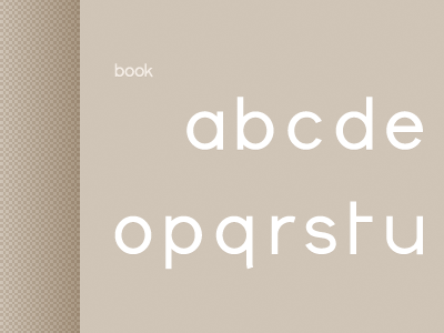
book
Helvetic Brands®
Available for work
Follow
Following
Like
Get in touch
#CFC4B6
#B2A390
#F9F7F5
#9F8D78
Download color palette
Part of the alphabet created for the wordmark of the company.
Rebound of
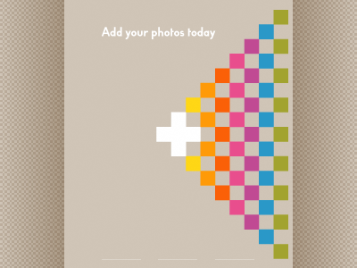
Add 2
By
Helvetic Brands®
custom
font
handmade
poster
print
sans serif
typeface
typography
View all tags
Posted on May 24, 2012
2,850
6
59
3
View feedback
Helvetic Brands®
Outside the box design, Swiss style
Get in touch
More by Helvetic Brands®
View profile
Previous
Next
Loading…
Loading…
Loading…