Mint Re-Design Concept


*unsolicited re-design of the Mint.com home page.
I've been working on a lot of client projects recently and I felt like doing something just for fun. Here were some goals I set for myself:
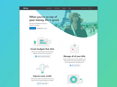
1) The orange used as the main CTA color lacks sufficient contrast ratio (white over orange) to pass WCAG standards. Black over orange would work, but then it feels a little Halloween-y. So, I wanted to shift to using a blue already in the Mint color palette for the CTA color.
2) It's very rare to see a light-themed website with a dark navbar. I get why. It draws a lot of attention when you likely want the user to focus on a CTA or other content. But, personally, I didn't think it was too distracting and I really liked Mint's off-black.
3) The H1 on the current site is "It's all coming together". I think it's too vague. But, "When you’re on top of your money, life is good," which sits just below it, is a great H1.
4) Benefits. Mint does a good job of speaking to the user and letting them know how their service will make their life better. But, their repeated more than once and the organization is a little confusing. For example, the benefits content is repeated 4 times throughout the home page. Redundancy can be a good thing to reinforce your message. But, too much repetitiveness can crowd the page and I wonder if it dulls the message. So, I wanted to trim the benefits to a single section hypothesizing it might give the benefits more clarity.
5) I chose to use spot illustrations for the benefits as opposed to stock photos or device mockups because I hypothesized that seeing the actual dashboards might feel a little overwhelming to a first-time user with all of the bar charts and numbers. Cheerful spot illos would play a more supportive role and communicate "This is easy!". I love the ones with the bell and the hot air balloon.
6) The main call-to-action is of course "Sign-up". But, I wanted to try sprinkling in some more specific CTAs related to a specific benefit like "Create your first budget" and "set up an alert". I think those might speak to some users more powerfully.
7) Mint makes a big deal out of the personalization you get from their service. So, why not tease some of the helpful suggestions you might see on the home page. Plus, they have tons of content on their blog that users would likely find helpful.
8) For a company that uses a mint leaf for their logo and uses a flora-inspired color palette, the current website aesthetic revolves around a tight grid system. I wanted to introduce curves and a more organic layout into the home page to match their brand a little more.
9) While they do have some stock photos towards the bottom of the page, the hero image is of a device. I wanted to experiment with using lifestyle photography that communicates budgeting isn't about restriction, but about achieving your goals through purposeful saving. Images (Eiffel one by Atikh Bana and beach one by Jamison McAndie) are from unsplash.
10) I thought with a little organization, the footer could be a helpful tool to help users find what they need.
11) Definitely wanted to keep Avenir, one of my favorite fonts.
That's probably way too much explanation. But, it's helpful for me to try to explain the design decisions I'm more or less making subconsciously.


