Find designers
Designer search
Quickly find your next designer
Post a job
The #1 job board for design talent
Inspiration
Courses
UX Diploma
Learn UX design from scratch in 6 months
UI Certificate
12-week UI skill building for designers
Live interactive workshops
with design professionals
Jobs
Go Pro
Log in
Dribbble: the community for graphic design
Log in
Sign up
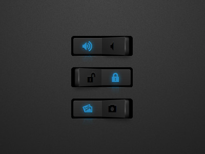
umbrUI Radio Button
simurai
Follow
Following
Like
#2E2E2E
#403F3E
#263A47
#268BC5
#3B7696
Download color palette
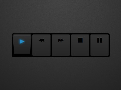
When there are checkboxes, radio buttons shouldn't be far away.
Update:
They're live
(Safari only).
Rebound of
umbrUI CSS3 checkboxes
By
simurai
button
css
css3
pictos
radio
ui
View all tags
Posted on Sep 22, 2010
19,500
27
186
22
View feedback
simurai
More by simurai
View profile
Previous
Next
Loading…