Find designers
Designer search
Quickly find your next designer
Post a job
The #1 job board for design talent
Inspiration
Courses
UX Diploma
Learn UX design from scratch in 6 months
UI Certificate
12-week UI skill building for designers
Live interactive workshops
with design professionals
Jobs
Go Pro
Log in
Dribbble: the community for graphic design
Advance your career with a Professional Diploma in UX Design
Learn more
Log in
Sign up
Nose Picker
Jed Bridges
Available for work
Follow
Following
Like
Get in touch
#EFF0F0
#191027
#BBAFAA
#C52F91
#4D9ACD
#2E4B9C
#CE434E
#A5856F
Download color palette
Rebound of
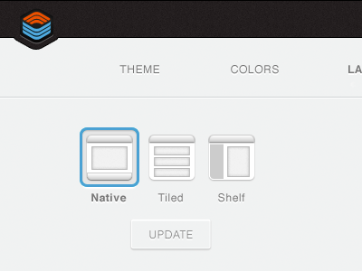
Layout Icons
By
Jed Bridges
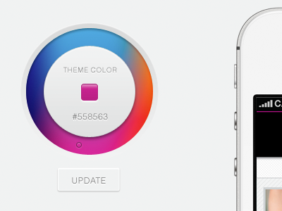
color
custom
dashboard
design
edit
icons
interface
layout
options
picker
ui
ux
web
View all tags
Posted on May 23, 2012
12,908
24
209
26
View feedback
Jed Bridges
Creating order from disorder, with design!
Get in touch
More by Jed Bridges
View profile
Previous
Next
Loading…
Loading…
Loading…