Find designers
Designer search
Quickly find your next designer
Post a job
The #1 job board for design talent
Inspiration
Courses
UX Diploma
Learn UX design from scratch in 6 months
UI Certificate
12-week UI skill building for designers
Live interactive workshops
with design professionals
Jobs
Go Pro
Log in
Dribbble: the community for graphic design
Advance your career with a Professional Diploma in UX Design
Learn more
Log in
Sign up
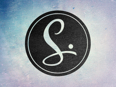
Softer, swooshy, S
Bermon Painter
Follow
Following
Like
#D2D4D7
#242424
#AAB5C7
#AAB1BF
#B0C9CD
#6A9AB1
#4A4F51
#3D6A94
Download color palette
Just tinkering a bit with a simple mark.
Rebound of
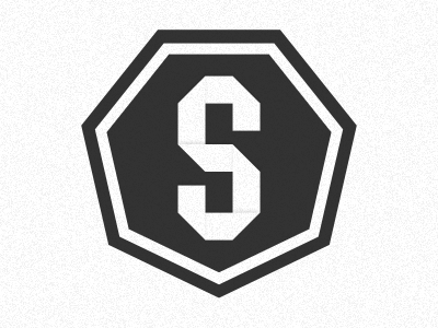
Origami S
By
Jina Anne
handlettering
logo
sass
typography
View all tags
Posted on May 22, 2012
1,177
1
15
6
View feedback
Bermon Painter
Welcome to my design portfolio on Dribbble
More by Bermon Painter
View profile
Previous
Next
Loading…