Avatar-me-short-hair-256x256

types of places

Shot_1285156082

11 Responses

  1. Pro Avatar-me-short-hair-256x256 Veerle Pieters

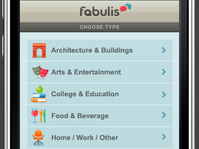
    Working on a whole bunch of colorful icons for the fabulis iPhone app. I'm creating them all in Illustrator and place them as Smart Objects in Photoshop. So far I have only done the main category/type ones but I have to do a ton of sub category/type ones.

    Just in case you wonder, all the layers of my app screen designs that contain graphics are all either shape layers or Illustrator Smart Objects. This way my design can be easily scaled to a bigger size without quality loss. Just trying to keep things as flexible as possible.

    over 1 year ago

  2. Pro Afd-newlogo-forum Aurélien Foutoyet

    Waho... so much details !
    This little chair icon is so cute :)

    I have realized only few weeks ago (what a shame...) that the The vector shapes are absolutely essential for working without risk of quality loss after any modification.
    Now I try to always use this tool and I wonder why I didn't realize this many years ago.

    over 1 year ago

  3. Luca Luca Paulina

    Very nice Veerle, I've always wanted to dabble with iconography, the project has yet to present its self, however when I do get the chance, you'll be categorised as inspiration. :)

    over 1 year ago

  4. Pro Yihavatar Bojan Janjanin

    This is lovely, Veerle. Don't know the entire context, but I'd maybe remove the "choose type" heading myself, it may not be necessary.

    over 1 year ago

  5. Avatar Alex Buga

    They're very nice and crisp but the poor fellow don't stand a chance against that background.

    over 1 year ago

  6. Pro Glenn (2) Glenn Van Bogaert

    An amazing eye for detail you have, Veerle. The colors, the background, the icons, etc. are so beautiful done. Again, an amazing work done by you.

    over 1 year ago

  7. Pro Confunded-square Matt Kump

    Gorgeous icons

    over 1 year ago

  8. Pro 1f8f6ded95a14175acba6c272c967787_7 Philip Renich

    Those are gorgeous icons, and I know that's primarily what this shot is about, but I think the text takes a decidedly back seat to the icons. Maybe deepening the grey a touch would help the text pop out for the user more?

    over 1 year ago

  9. Bonio3 Paul Maloney

    I agree with Philip the icons are stunning, the text colour is a little wishy washy.

    over 1 year ago

  10. Pro Avatar-me-short-hair-256x256 Veerle Pieters

    Been so busy continuing this project and others that I didn't find a moment yet to check back here :) Thank you so much for the great feedback guys.

    over 1 year ago

  11. Ovan-golden-eye-640 oVan

    As usual I love the color palette, warm & fresh at the same time. I'm not sure about the dot grid to continue over the buttons, looks to me as a gaze over the entire screen. Maybe embossing them a bit, or a lighter shade above the buttons?

    over 1 year ago

keyboard shortcuts: previous shot next shot L or F like