Insta GUI (.psd)

some insta practice.
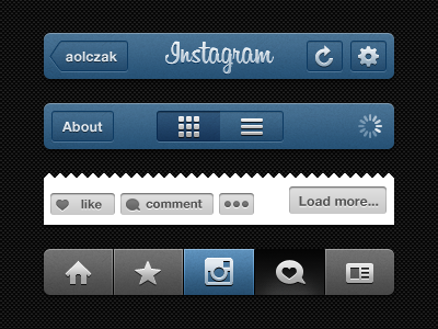
details that make IG soft yet sharp:
- the 3px light/black/light dividers makes tabs looks sharp
- constant subtle noise
- gradient on texts (btn) are following their friends the icons.
- every icons are custom made, never see them in a set
- not much sharp angle, everything's just 1/2px rounded which make it look soft to the eyes, yet clean.
Insta_GUI.psd
3 MB


