Snoww App


Snoww App Redesign / Structure
Overview
To restructure and redesign one of the top ski / snowboard tracking apps based on my experiences as a snowboarder.
Issues
Although the app is one of the largest in its field, as a user and a designer, I feel as though certain areas could be improved to not only further enhance the users perception of the app but to increase the user experience value throughout.
A few issues which become tiresome:
Lack of labels on the core navigation makes it hard to understand which tab does what.
Too many icons. I find myself endlessly clicking on different tabs to find a particular control.
The app itself relies heavily on user generated times as well as the inclusion of friends. If you use the app just for runs, the feed tab becomes pretty much obsolete.
The Result
Overall, I’ve gone through 3 of the major pages and given them an overhaul to what I believe would enhance the general user experience as well as the retention rate during the summer months.
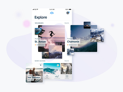
Explore
I’ve made the conscious decision to remove the Feed from the app altogether. Although I liked the interaction element of befriending people and keeping track of their runs, holidays etc, I feel this space could be better improved by the use of an Explore tab instead.
Here, users can easily view the top rated resorts for that season as well as discover additional runs based on location. The Explore tab is designed to become an informative area which would look to increase user retention during the off-season by allowing users to discover runs / resorts they’d like to try out come the new season.
This area also opens up the possibility of in-app advertising, thus providing an alternative financial solution for the company.
Start Run
I’ve removed the ambiguous icons at the bottom and replaced with more concise, widely accepted icons for the user to use.
An animation sequence has been added to the header which will bring this, otherwise numbers driven design to life, whilst the lower part of the design is split into 3 easy-to-use tabs.
Leaderboard
As with the statistics/run tab, I’ve taken the liberty to enhance the Leaderboard by bringing in a more playful structure.
This can be easily seen by the illustrated podium the top 3 users will be proudly positioned upon, whilst the users own position is clearly highlighted further down. Here, with the use of the actions button, the user would be able to easily share, remove, compare, save their score with their friends or to their profile.
Conclusion
To conclude, redesigning the app in this way, I believe the new features would not only increase the user experience but also the user retention, making the product more valuable throughout the year rather than every skiing season.
I’d very much like to hear your thoughts on my process and whether you agree that the changes would be beneficial to the app in question or a step backwards. Are there elements you particularly like or dislike? Do you think the original designs are better than the redesigns? Could more be done to further enhance the app for the users?
If you’re interested in downloading the app in questions, you can find it on the app store here.
And please, please don’t just put in the comments” Nice design”, “Cool colours” or “Looks Great!” :p


