Find designers
Designer search
Quickly find your next designer
Post a job
The #1 job board for design talent
Inspiration
Courses
UX Diploma
Learn UX design from scratch in 6 months
UI Certificate
12-week UI skill building for designers
Live interactive workshops
with design professionals
Jobs
Go Pro
Log in
Dribbble: the community for graphic design
Advance your career with a Professional Diploma in UX Design
Learn more
Log in
Sign up
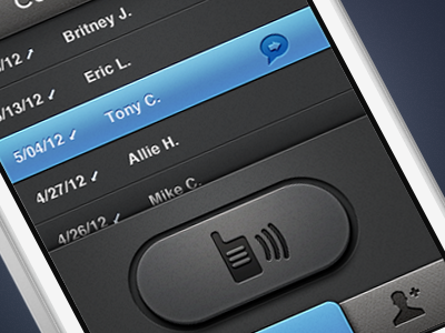
iPhone Walkie Talkie Concept
James Cipriano
Follow
Following
Like
#303132
#D2D6D7
#5C9DCE
#343A48
#3D6E9F
Download color palette
WIP iphone app concept. Check out attachment for full view.
app
button
design
icons
interface
ios
iphone
mobile
talkie
texture
ui
walkie
View all tags
Posted on May 20, 2012
12,543
57
332
30
View feedback
James Cipriano
Product Designer
More by James Cipriano
View profile
Previous
Next
Loading…