


Silverback Logo concept

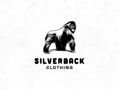
Working on two versions for Silverback: a detailed one as shown here and a super simplified one based on my usual more geometric design process. I very much like the strong, proud and casually calm and relaxed character of this version, though I didn't want to get too much involved into polishing this concept as the client will probably go for the simplified geometric version anyway.
Note that this is not a finished version like I mentioned above, and I'm awere that the type sucks bigtime! As you can see the Silverback needs some more polish on the curves at the shoulder and its back leg, as well as a few other details. The Silverback type is a blurry fucked up version of Cubano.
Edit: bad bad experimentation of typography here, I know ;)


