Scoop Society Logi

Scoop Society Logo design
...
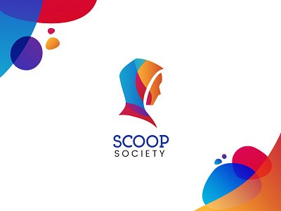
#BehindTheDesign Was commissioned to come up with a uniquely memorable logo for secrecy and expression. The most challenging part in designing this particular logo is to come up with a mark that is both exclusive yet inviting…
...
For exclusivity or secretive mark, out of dozens of iterations, we narrowed down our options to a hooded person facing the side. While that checks the box for secrecy, how about the “inviting” aspect?
...
While “form follows function” (Hooded person = secrecy), we can also characterize the mark through the use of colors (colors = emotions). Thus, we came up with a spectrum of vibrant colors to be flexibly used in the logo and in other materials.
...
While the platform is exclusive to certain people, the logo hopes to achieve inviting aesthetic which promotes the openness and expressive tone of the business
...
Some key takeaways when designing logos:
1. “Form follows function” can be translated to ‘symbol follows function’ sometimes the most obvious one’s are the best.
2. Use color as an extension to the mark’s purpose.
...
Hope this may help some of you overcome design challenges 🙂Cheers!
...
Will be posting more on Instagram, follow be there at https://www.instagram.com/pgabreyes/


