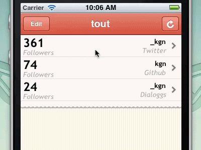
I've been working on this app for a couple weeks and the UI is finally looking good enough to start showing it :) This gif shows how new accounts are added.
Everything, except for the service badges, is drawn in code.
Please ignore the unfinished table rows :)
Follow @tout_app on twitter to track the process of the app!
@Eli Schiff thought about it :) The code needed to generate the dialoggs logo would probably inflate the size of the app just as much, if not more, than the image. That's also assuming I could recreate the amazing work @SoftFacadedid on it :)
This looks very cool, but I think in an actual app setting, this functionality would not make much sense to the user. iOS apps have trained us that Pull means refresh, an action that will not take the user away from the current view.
With *this* functionality, users will find themselves in the "add account" view, having gone there without conscious thought, with no memory of how they got there. In principle, this is not a bad bit of UI, but it goes against all the conventions previously set by other "Pull to Refresh" apps, enough to be alienating to users.
Far better to have pull refresh, and replace your "refresh" button with an "add account" button.
@Max Luzuriaga Others have brought this up to me as an issue as well. My reasoning behind doing 'pull to add' instead of 'pull to refresh' is that I think that pull to refresh on content that is not added to is wrong. I love how 'pull to refresh' conveys that new items are being pulled down and added to the list. It works great for lists like email and twitter. I don't like when pull to refresh is used on lists where the data just updates and no items are added, like in this app.
However this might be too much of a purist view. Convention and user expectations might need to win out. What do others think?
Well personally I would love to see more consistency in gestures throughout iOS, particularly when it comes to pulling down on a scroll view.
This is definitely not a horrible use for the gesture, but it bothers me somewhat. Maybe it's because this particular screen of the app has the ability to refresh its data. In this context, pulling to refresh would only seem natural. Pulling to add more accounts seems a little bit jarring, and perhaps it might be better suited to a different gesture, or even perhaps a completely new screen.
Another alternative could be to use the recent Path/Facebook-esque side panels to add a new account. Who knows? Just figure out what's best for your users. ;)
Thanks to everyone for their feedback here and on twitter! I've thought about this a lot and was ready to switch the behavior but came up with a situation that makes 'pull to add' and a refresh button better. If the list is long the user would need to scroll to the bottom of the table to view the last items. If they then want to refresh these items they would need to scroll to the top of the table, use pull to refresh, then scroll back down to the bottom to see if there were any changes. This is what makes pull to refresh work so well in email and twitter clients because you are always at the top of the list when you want to refresh. For this reason I am going to stick with pull to add and a refresh button.
23 Responses
Pro
David Keegan
I've been working on this app for a couple weeks and the UI is finally looking good enough to start showing it :) This gif shows how new accounts are added.
Everything, except for the service badges, is drawn in code.
Please ignore the unfinished table rows :)
Follow @tout_app on twitter to track the process of the app!
about 1 year ago
Pro
Avinash Tripathi
thats some effort on animation :)
Nice work here!
about 1 year ago
Pro
Drew Wilson
NICE!!!
about 1 year ago
Pro
Eli Schiff
I wouldn't have put it past you to code the dialoggs logo.
about 1 year ago
Awesome concept!
about 1 year ago
Pro
Blain Smith
Is that Comic Sans I see? :-) Very nice looking app!
about 1 year ago
Pro
Nick Dominguez
I like it.
about 1 year ago
Pro
David Keegan
@Blain Smith it's Chalkboard, what do you think of that font choice?
about 1 year ago
Pro
David Keegan
@Eli Schiff thought about it :) The code needed to generate the dialoggs logo would probably inflate the size of the app just as much, if not more, than the image. That's also assuming I could recreate the amazing work @SoftFacade did on it :)
about 1 year ago
nice job David :)
about 1 year ago
Pro
James Scott
Great work as usual man.
about 1 year ago
Pro
Zan | ninetofive.me
Really good work David! Would love to see more details of this. Should be a super smooth experience once you are done!
about 1 year ago
Pro
Gil
really nice!
about 1 year ago
Pro
Victor Coulon
Cool, looking forward to play with that David.
about 1 year ago
Pro
Andy Eveland
nice. I'd love to see how you did the +-> in code... like the demo using a gif too!
about 1 year ago
Pro
Andy Eveland
http://graphicriver.net/item/roughly-write-set-handwriting-194-glyphs-ttf/122800 might be a good option for the font?
about 1 year ago
Pro
David Keegan
@Andy Eveland PaintCode was used to generate the code for the arrow, then the view is based on this project.
about 1 year ago
This looks very cool, but I think in an actual app setting, this functionality would not make much sense to the user. iOS apps have trained us that Pull means refresh, an action that will not take the user away from the current view.
With *this* functionality, users will find themselves in the "add account" view, having gone there without conscious thought, with no memory of how they got there. In principle, this is not a bad bit of UI, but it goes against all the conventions previously set by other "Pull to Refresh" apps, enough to be alienating to users.
Far better to have pull refresh, and replace your "refresh" button with an "add account" button.
about 1 year ago
Pro
David Keegan
@Max Luzuriaga Others have brought this up to me as an issue as well. My reasoning behind doing 'pull to add' instead of 'pull to refresh' is that I think that pull to refresh on content that is not added to is wrong. I love how 'pull to refresh' conveys that new items are being pulled down and added to the list. It works great for lists like email and twitter. I don't like when pull to refresh is used on lists where the data just updates and no items are added, like in this app.
However this might be too much of a purist view. Convention and user expectations might need to win out. What do others think?
about 1 year ago
Well personally I would love to see more consistency in gestures throughout iOS, particularly when it comes to pulling down on a scroll view.
This is definitely not a horrible use for the gesture, but it bothers me somewhat. Maybe it's because this particular screen of the app has the ability to refresh its data. In this context, pulling to refresh would only seem natural. Pulling to add more accounts seems a little bit jarring, and perhaps it might be better suited to a different gesture, or even perhaps a completely new screen.
Another alternative could be to use the recent Path/Facebook-esque side panels to add a new account. Who knows? Just figure out what's best for your users. ;)
about 1 year ago
Pro
David Keegan
Thanks to everyone for their feedback here and on twitter! I've thought about this a lot and was ready to switch the behavior but came up with a situation that makes 'pull to add' and a refresh button better. If the list is long the user would need to scroll to the bottom of the table to view the last items. If they then want to refresh these items they would need to scroll to the top of the table, use pull to refresh, then scroll back down to the bottom to see if there were any changes. This is what makes pull to refresh work so well in email and twitter clients because you are always at the top of the list when you want to refresh. For this reason I am going to stick with pull to add and a refresh button.
about 1 year ago
Pro
Blain Smith
@David Keegan I like Chalkboard, but at that size you can't see the "chalkiness" texture which made me think it was Comic Sans.
about 1 year ago
Pro
Tanveer Junayed
So rad!
12 months ago