Very nice man! Clean and readable. I really like how well you pulled off the design elements without them being obtrusive. With the exception of "live" appearing to be "lives". Nice work!
Love the way that 'v' swoops over to the 'e', that curve is stunning! The overall style is really distinctive, nice combination of curves and straight lines.
15 Responses
Pro
Jeff Jenkins
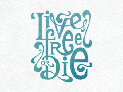
This is the state motto of New Hampshire. I've always liked it. I decided to juxtapose the seriousness of the motto with less-than-serious lettering.
about 1 year ago
Pro
Steely
Love it Jeff - fantastic type work!
about 1 year ago
Pro
Jeff Jenkins
@Brian Steely Thanks very much :)
about 1 year ago
Very nice man! Clean and readable. I really like how well you pulled off the design elements without them being obtrusive. With the exception of "live" appearing to be "lives". Nice work!
about 1 year ago
Pro
Jeff Jenkins
@Matthew Wagner Yeah, I see what you mean. Glad you like it :)
about 1 year ago
Really nice lines sir.
about 1 year ago
Pro
Jeff Jenkins
@Brent Burdick Thanks :)
about 1 year ago
Love the way that 'v' swoops over to the 'e', that curve is stunning! The overall style is really distinctive, nice combination of curves and straight lines.
12 months ago
Pro
Jeff Jenkins
@Claire Coullon Thanks Claire, much appreciated!
12 months ago
Loving it! @Jeff Jenkins.
12 months ago
Pro
Jeff Jenkins
@Hendrik-Jozef Bisschop Thank you!
12 months ago
Pro
Alexander Wende
This is great! Really like the flow of the letters, the negative space between the letters is also well defined and harmonic.
12 months ago
Pro
Jeff Jenkins
@Alexander Wende Thanks Alexander, I really appreciate that :)
12 months ago
Really wonderful!
12 months ago
Pro
Jeff Jenkins
@Hannah Boresow Thank you!
12 months ago