Comments Animation

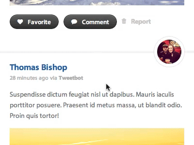
Comments animation for a web app that is in progress. If the user wants to comment on an item, the comment form slides down, and can be hidden to cancel. Feedback is appreciated, both good and bad!
Comments animation for a web app that is in progress. If the user wants to comment on an item, the comment form slides down, and can be hidden to cancel. Feedback is appreciated, both good and bad!


