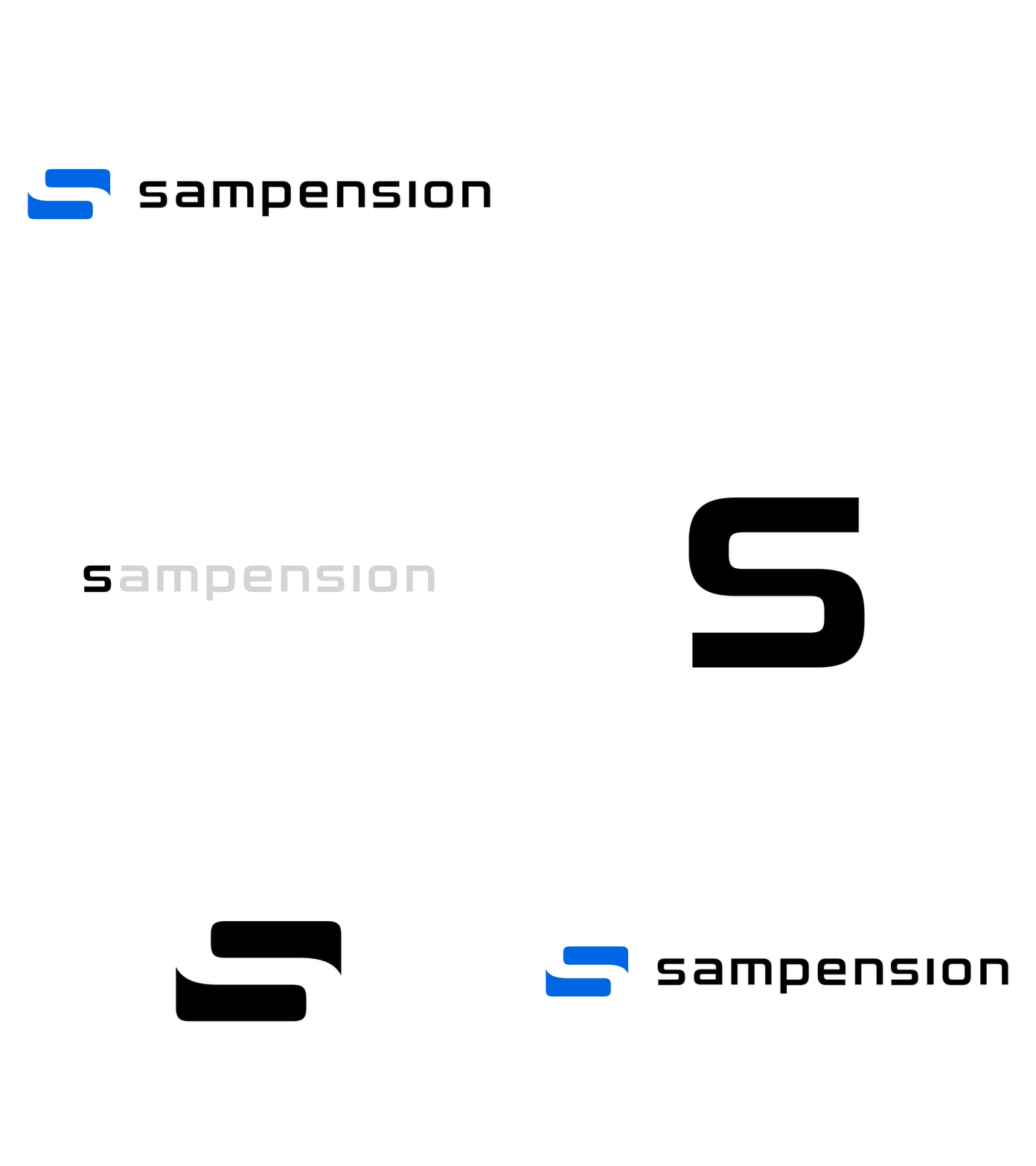
Sampension logomark
Recently designed this logomark for the danish pension fund Sampension. Besides being a pension fund Sampension provides administrative services such as life insurance and general asset management.
The logomark which symbolises two speech bubbles, is supposed to underscore that Sampension is all about communication, dialog and great customer service. Additionally the negative space between the speech bubbles symbolises a “path” or “road” communicating that the company follows and supports their customers on the path through life. From joining the workforce to retirement. The logomark which was meant to be used as an additional add-on to go with their current logotype was unfortunately rejected by the client.
More by Jacob Larsen View profile
Like


