Find designers
Designer search
Quickly find your next designer
Post a job
The #1 job board for design talent
Inspiration
Courses
UX Diploma
Learn UX design from scratch in 6 months
UI Certificate
12-week UI skill building for designers
Live interactive workshops
with design professionals
Jobs
Go Pro
Log in
Dribbble: the community for graphic design
Advance your career with a Professional Diploma in UX Design
Learn more
Log in
Sign up
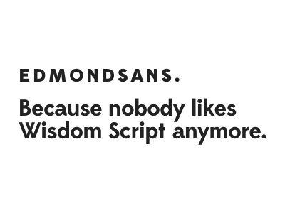
New typeface out tomorrow!
OH no Type Co.
Follow
Following
Like
#FFFFFF
#232323
#9F9F9F
#5D5D5D
Download color palette
Coming soon to Lost Type
lost type sans
type design
View all tags
Posted on May 15, 2012
5,755
10
259
35
View feedback
OH no Type Co.
More by OH no Type Co.
View profile
Previous
Next
Loading…