


Superhero Sketch (Animated)


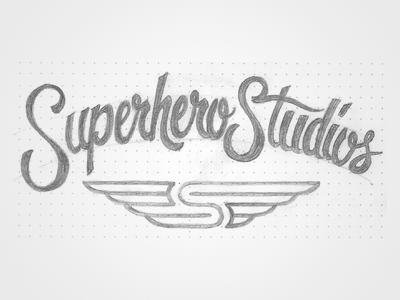
Roughed this logo out this morning, and I'm playing with the mark trying to figure out how to best fit it together with the type. Do you like one of these options, or should I get rid of the arch in the type and go with the straight, flat mark?
Also, after scanning this bad boy in and looking at it on-screen, I see that the initial "S" could use some thickening, so I'm on that. :)
Bigger shot of the original attached, so if you see anything crazy, let me know!


