Credit Report analytics chart - Daily UI 018

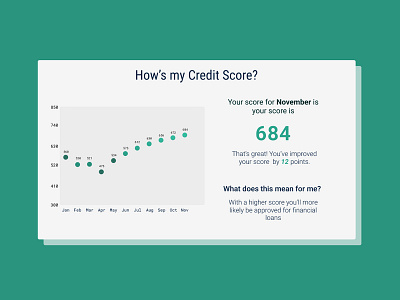
Overview report of user's credit score. The chart is secondary and less pronounced as users are just trying to find out their current standing. The chart alone could have delivered the same information but the messaging on the right engages the user and recaps what they need to know and explains why that information is valuable.
From my own experience, credit can be confusing and to have a visual representation and a message helps my learning process. I hope it does the same for other users.


