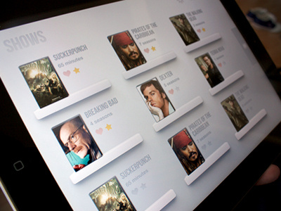
Tv Shows app - New layout

25 Responses

  1. Miguel Oliva Márquez Miguel Oliva Márquez

    Hey guys, i just changed the layout here.

    This time, I worked on little boxes that you press.
    Keeping the clean aspect of the previous version, but having bigger images makes the grid feel like it's got more content.

    Shows that have new items will show the name in Blue

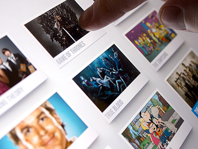
    Photo by @enriquealex

    Check full size :)

    likes

    about 1 year ago

  2. Pro Matt Price Matt Price

    I love how clean it is. It really lets the eyes focus on the tv shows. Nicely done sir.

    likes

    about 1 year ago

  3. Andrey S. Rodrigues ☝ Andrey S. Rodrigues ☝

    nice, very clean Miguel!

    likes

    about 1 year ago

  4. Pro Adrien Olczak Adrien Olczak

    those floating papers def looks simpler & cleaner.

    likes

    about 1 year ago

  5. Pro Alpis Design Alpis Design

    Looking great man! :)

    likes

    about 1 year ago

  6. Thuy Gia Nguyen Thuy Gia Nguyen

    I like the paperish color in the background. It gives the whole thing a good feeling. Like it!

    likes

    about 1 year ago

  7. Lee Fuller Lee Fuller

    Super clean, colours work really well. Great Work.

    likes

    about 1 year ago

  8. Pro Dámaso Benítez Dámaso Benítez

    Great capture!

    likes

    about 1 year ago

  9. Pro Dmitriy Chuta Dmitriy Chuta

    Nice

    likes

    about 1 year ago

  10. Pro Aqib Mushtaq Aqib Mushtaq

    Great work :)

    likes

    about 1 year ago

  11. Pro Maxwell Barvian Maxwell Barvian

    I love that this still looks amazing when you view the real pixels :D

    likes

    about 1 year ago

  12. Miguel Oliva Márquez Miguel Oliva Márquez

    Thank you very much guys!
    @Aqib Mushtaq thank you man!
    @Maxwell Barvian It's retina but It's kind of big to upload the full res :(

    likes

    about 1 year ago

  13. Pro Tanveer Junayed  Tanveer Junayed 

    @Miguel Oliva Márquez :: Man, really really nice. Love that pressed effect.

    likes

    about 1 year ago

  14. Pro Darcy Murphy Darcy Murphy

    Nicely done, and I love the photo. The finger in the shot adds context and makes the UI more appealling. It's a great touch (hahaha).

    likes

    about 1 year ago

  15. enriquealex enriquealex

    Nice photo! :P haha

    likes

    about 1 year ago

  16. Pro Matthew Sanders Matthew Sanders

    Depth for the win sir.

    likes

    about 1 year ago

  17. Pro Remko Dijksma Remko Dijksma

    very nice love the depth!

    about 1 year ago

  18. Sam Mearns Sam Mearns

    Super Crisp... *****

    about 1 year ago

  19. Pro Petyr Petyr

    Love it

    about 1 year ago

  20. andrew naveen andrew naveen

    This is super cool ..:D

    about 1 year ago

  21. Dan Otis Dan Otis

    Is this app available? Love it!

    11 months ago

  22. Miguel Oliva Márquez Miguel Oliva Márquez

    Hello @Dan Otis
    Not yet, it should be ready in a month or so :)

    likes

    11 months ago

  23. Pro Timothy Nice Timothy Nice

    Looks very nice

    likes

    2 months ago

  24. Arturo Martín Arturo Martín

    Cool

    likes

    about 1 month ago

  25. Gavin McFarland Gavin McFarland

    Very nice, I prefer this approach. :)

    likes

    22 days ago

keyboard shortcuts: previous shot next shot L or F like