No time like the present - lettering sketch

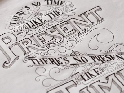

Inked up version of my final poster in my Quotes series. full phrase is 'There's no time like the present, there's no present like time' full view is attached too.
Will publish the full project with all 7 posters soon!


