Find designers
Designer search
Quickly find your next designer
Post a job
The #1 job board for design talent
Inspiration
Courses
UX Diploma
Learn UX design from scratch in 6 months
UI Certificate
12-week UI skill building for designers
Live interactive workshops
with design professionals
Jobs
Go Pro
Log in
Dribbble: the community for graphic design
Log in
Sign up
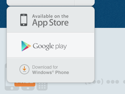
Download dropdown
Kerem Suer
Available for work
Follow
Following
Like
Get in touch
#E4E8EB
#BDC7C2
#0D4871
#013962
#696B6C
#B88F65
Download color palette
Dropdown menu, Google play is the hover state.
app
app store
dropdown
drop down
google play
minimal
ui
ux
web
windows phone
View all tags
Posted on May 13, 2012
48,719
54
515
17
View feedback
Kerem Suer
Welcome to my design portfolio on Dribbble
Get in touch
More by Kerem Suer
View profile
Previous
Next
Loading…
Loading…
Loading…