Peachy Logotype


Here's a look at the logotype for Peachy. Coming out of strategy, we knew we were going after a logotype-only approach.
Not every company needs a mark. In fact, if our clients request a mark, we often ask for their reasons why. They want it tell so much of their brand story and their brand attributes. While we certainly try to take these things into account while designing a brand identity, this isn't the only job of a logo. And actually, the logo is only the first part of that story; it's a conversation. We're looking forward to helping Peachy tell that story as their brand evolves.
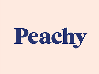
Peachy's logotype is based on ITC Grouch. Originally designed in the 70s, each letterform was redrawn to update it for today's digital landscape and to increase ownability.
Check out the attachment for of the modifications we made. Mega props to @Chase Turberville for his work and type expertise in making these mods.


