Obox Mobile Logo 2

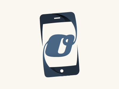
Switched around the swishes, and framed the logo so that it fits inside an iPhone outline, I think I will be going with this exact logo but once again your opinions are most welcome :)
Switched around the swishes, and framed the logo so that it fits inside an iPhone outline, I think I will be going with this exact logo but once again your opinions are most welcome :)


