Dashboard Navigation

Dashboard_online

13 Responses

  1. Josh Giblette Josh Giblette

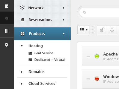
    Dashboard / menu concept for handling multiple levels of navigation.

    Love or hate it, I would love to hear any feedback you may have.

    about 1 year ago

  2. Joshua Schaible Joshua Schaible

    Great job.

    about 1 year ago

  3. Pro Bryan Kearney Bryan Kearney

    Oooh. I really like this! For the main level of navigation, do you get a hover?

    about 1 year ago

  4. Pro Roberto Ortiz Roberto Ortiz

    Nice work.

    about 1 year ago

  5. Arun Kumar Dadhwal Arun Kumar Dadhwal

    Gorgeous UI, can't praise enough!

    about 1 year ago

  6. Pro Paresh Khatri ::::✈ Paresh Khatri ::::✈

    I really like this piece but have one suggestion grey background that you have used at right its seems to be out of place it should be light blue as you have used in the middle to match up the theme...

    about 1 year ago

  7. Pro Dan O'Prey Dan O'Prey

    Is this for AWS?

    I presume the AWS looking icon on the left is the one that is selected, but it looks more like it is disabled. I would have it lighter than the others when selected, so it connects more with the menu in the middle.

    about 1 year ago

  8. Pro Kevin Jannis Kevin Jannis

    Looks awesome! Great details!

    about 1 year ago

  9. Adam Safar Adam Safar

    Love the concept and the colors, great work!!

    about 1 year ago

  10. Pro Ivan Tolmachev Ivan Tolmachev

    In the second navigation, love the white on blue type, but black type looks too stark

    about 1 year ago

  11. Josh Giblette Josh Giblette

    Thanks everyone!

    @Paresh Khatri - Good point, I'm still playing around with the connection between those two menu elements.

    @Dan O'Prey No, not an AWS project and yup still playing with the active/inactive states.

    about 1 year ago

  12. Pro Zac Halbert Zac Halbert

    Very beautiful, lots of breathing room.

    Have you thought about some indicator linking the left dark gray nav to the blue/white nav? Something like an arrow that breaks that vertical line or a slight shadow on the child element? From looking at this, I'm not sure if the two navs have a parent/child relationship or an independent one.

    Also, I dig the network icon--it's pretty unique.

    about 1 year ago

  13. Josh Giblette Josh Giblette

    Thanks @Zac Halbert. Yes, I've received a lot of solid feedback regarding the relationship between the gray and blue navigation. I'm currently working up an adjustment for that area.

    Thanks for the feedback. Much appreciated.

    about 1 year ago

keyboard shortcuts: previous shot next shot L or F like