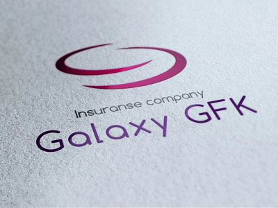
Logo design for a insurance company
The visual concept is based on the name. The direct association with the galaxy is its vastness. The limitless services and the opportunities offered by the company are based on this. Stylised galaxy with open ends talks about open thinking as company philosophy.
Round shapes carry an additional association for comprehensiveness and security, and that the customer is always in the centre.
View all tags
Posted on
Nov 8, 2018
More by Bobby Burkov View profile
Like


