Ranger Combat Dive Team

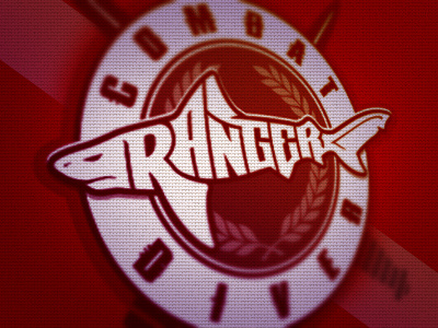

The Ranger Combat Dive Team wanted a logo that had a bull shark that was made by spelling out "Ranger", this is what I came up with. I think it will make a rad patch for there uniforms & training gear, but maybe not with the dive flag colors. Thoughts? Feedback and Comments most welcome & appreciated!


