I don't think you should change it. Super cool looking. Cheesy is a good thing in my opinion. I don't think we all should not be designing for Windows metro, its trendy right now but it will pass as well. The only thing I would change is making the "play" text a little more readable with a slightly darker drop shadow on the text. Its a little hard to read at first glance. Keep up the good work!
7 Responses
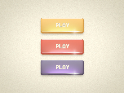
Got some feedback suggesting I play with the typeface, so I changed the font from Rocks to Cubano. Improvement?
about 1 year ago
Pro
Gareth Botha
These are beautiful
about 1 year ago
wow, thanks @Gareth I appreciate it.
about 1 year ago
that glow is so cheesy :))))
8 months ago
how would i fix it @Ryan ?
8 months ago
Pro
derric
I don't think you should change it. Super cool looking. Cheesy is a good thing in my opinion. I don't think we all should not be designing for Windows metro, its trendy right now but it will pass as well. The only thing I would change is making the "play" text a little more readable with a slightly darker drop shadow on the text. Its a little hard to read at first glance. Keep up the good work!
7 months ago
great feedback @derric thank you
7 months ago