Find designers
Designer search
Quickly find your next designer
Post a job
The #1 job board for design talent
Inspiration
Courses
UX Diploma
Learn UX design from scratch in 6 months
UI Certificate
12-week UI skill building for designers
Live interactive workshops
with design professionals
Jobs
Go Pro
Log in
Dribbble: the community for graphic design
Log in
Sign up
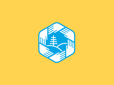
The Health Alliance of Northern California
Sean Heisler
Available for work
Follow
Following
Like
Get in touch
#FFD350
#04A5E4
#FCFEFE
#A6DFF5
#52B7C7
#70CCEF
#94BE8D
#B8C578
Download color palette
A proposed symbol for them that they ended up not going with.
hands
healthcare
identity
logo
logotype
minimal
modern
mountain
simple
symbol
tree
View all tags
Posted on May 8, 2012
10,288
30
210
20
View feedback
Sean Heisler
Brand design & illustration.
Get in touch
More by Sean Heisler
View profile
Previous
Next
Loading…
Loading…
Loading…