I think this has a great feel for what this is for, Colin, nice work. If I had any suggestion I would only say it might be interesting if there was a hint more of a western feel, some kind of subtle touch, but not changing much from what you have here. That S is great, that is carrying some sort of Western flavor in some regard. Love the o's.
Great to see this Colin, beautiful shot. Nice call with those diagonal guidelines, the drawing really has nice consistent rhythm to it. I'm really curious to see the vector version now too!
Great-looking sketch, my man. Love the analog gridlines!
Building on what @Sean Heisler said up there, what if you turned the terminal of that A into a lady leg wearing a crazy-embellished cowgirl boot with a super-curled-up femmy cowgirl hat dangling from her toe? I think that would be just the right amount of subtle Western flair that would really liven this thing up.
And add more roses, thorns, and maybe a pair of horns. And a side of guacamole.
@Sean Heisler LOL! Nah man, a little friendly ribbing, maybe, but I was mostly just running off at the mou...errr...fingertips, and poking a bit of fun at the original, overly-embellished logo attempt (done by someone else) that Colin was asked to redesign.
am i going to have to mediate this forum? @Sean Heisler please excuse @Jon Stapp and his attempt at humor...he is very bored at work and needs to cut loose and start atomicvibe asap!
@Jon Stapp Ha! Sounds like this must be a redesign and the old one was overtly western? He he, love to see that. No, but, seriously, if it's primarily for western cowgirl boots it might be interesting if there was a "nod" to that genre without being cliche. But @Colin Tierney hints that he may be doing that in the vector version. Can't wait to see it! In the meantime, Colin, tell your friends to quit picking on me.
@Sean Heisler No, the old one was overly sucky. Think graphics you would find on a shirt worn by either Brett Michaels or The Situation. Sorry, Colin, I know I used that joke on you already, but to everyone else, that's the freshness.
28 Responses (page 1 of 2)
Pro
Colin Tierney
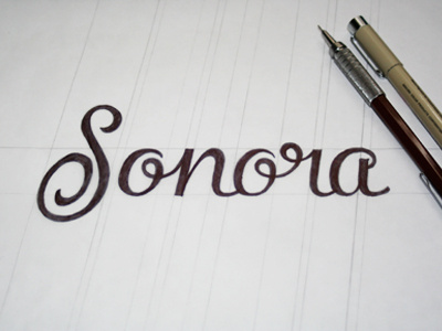
the name is based off of the sonoran desert. up and coming female shoe line that consists of primarily western cowgirl boots.
about 1 year ago
Pro
Muhammad Ali Effendy
Impressive!
about 1 year ago
Pro
Mark Jooste
So good!
about 1 year ago
Pro
Forsuregraphic
Really fine
about 1 year ago
Pro
Jord Riekwel
Nothing short of amazing...
about 1 year ago
Pro
Jeff Jenkins
Sweet.
about 1 year ago
Colin, the 'S' and 'o' are flat out rad.
about 1 year ago
Pro
Paulius Kairevičius
This is so beautiful can't wait till I see vector version :-)
about 1 year ago
Pro
Sean Heisler
I think this has a great feel for what this is for, Colin, nice work. If I had any suggestion I would only say it might be interesting if there was a hint more of a western feel, some kind of subtle touch, but not changing much from what you have here. That S is great, that is carrying some sort of Western flavor in some regard. Love the o's.
about 1 year ago
Pro
Colin Tierney
@Sean Heisler stay tuned brother. it's all in the vectored version.
about 1 year ago
Great to see this Colin, beautiful shot. Nice call with those diagonal guidelines, the drawing really has nice consistent rhythm to it. I'm really curious to see the vector version now too!
about 1 year ago
nice typo
about 1 year ago
Pro
Jon Stapp | atomicvibe
Great-looking sketch, my man. Love the analog gridlines!
Building on what @Sean Heisler said up there, what if you turned the terminal of that A into a lady leg wearing a crazy-embellished cowgirl boot with a super-curled-up femmy cowgirl hat dangling from her toe? I think that would be just the right amount of subtle Western flair that would really liven this thing up.
And add more roses, thorns, and maybe a pair of horns. And a side of guacamole.
about 1 year ago
Pro
Joseph Alessio
Can I take that "a" home with me?
about 1 year ago
I'm from Sonora :B and I like this lettering/logo ..
about 1 year ago
Pro
Sean Heisler
@Jon Stapp Ha ha! I can't tell if you are slamming me or not! :)
about 1 year ago
Pro
Jon Stapp | atomicvibe
@Sean Heisler LOL! Nah man, a little friendly ribbing, maybe, but I was mostly just running off at the mou...errr...fingertips, and poking a bit of fun at the original, overly-embellished logo attempt (done by someone else) that Colin was asked to redesign.
about 1 year ago
Pro
Colin Tierney
am i going to have to mediate this forum? @Sean Heisler please excuse @Jon Stapp and his attempt at humor...he is very bored at work and needs to cut loose and start atomicvibe asap!
about 1 year ago
Pro
Sean Heisler
@Jon Stapp Ha! Sounds like this must be a redesign and the old one was overtly western? He he, love to see that. No, but, seriously, if it's primarily for western cowgirl boots it might be interesting if there was a "nod" to that genre without being cliche. But @Colin Tierney hints that he may be doing that in the vector version. Can't wait to see it! In the meantime, Colin, tell your friends to quit picking on me.
about 1 year ago
Pro
Jon Stapp | atomicvibe
@Sean Heisler No, the old one was overly sucky. Think graphics you would find on a shirt worn by either Brett Michaels or The Situation. Sorry, Colin, I know I used that joke on you already, but to everyone else, that's the freshness.
about 1 year ago
I design an app by the same name and I love what you've done with the word :)
about 1 year ago
Pro
Florin Capota
very nice Colin, very nice
about 1 year ago
Pro
Milosz Klimek
Nicely done, Colin.
about 1 year ago
Pro
Jeremiah Wingett
I really love that o-r ligature!
about 1 year ago
Pro
Michael Spitz
Great flow Colin.
about 1 year ago