Interfaith Homes Concept

Concept design for Interfaith Homes in Kalamazoo, MI
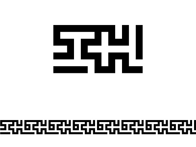
The mark takes the form of the monogram of the letters I and H interlocked. creating something clean and versatile were my main concerns. Black and white make for easy reproduction and the geometric design allows for maximum legibility. The monogram is also legible in a vertical orientation as a tertiary option for space saving.
The interlocked nature of the mark is also left opened on either end, which allows multiples of the logos to be linked together to form a pattern that can be used in a number of applications, including the letterhead I have included and for applications including business cards, shirts, etc.
Conceptually, I wanted the logo to be architecturally reminiscent considering the nature of the organization as a housing complex. The open ended arms of the I and H are not only intended as a a call out to architectural plans, but more conceptually as open to those in need. Finally, you may notice a bit of an implied cross. A small reference to faith, but one that is embedded into the overall mark and not intended to promote christian symbols, more as a part of the interlocking whole as is implied in the name Interfaith Homes.


