Find designers
Designer search
Quickly find your next designer
Post a job
The #1 job board for design talent
Inspiration
Courses
UX Diploma
Learn UX design from scratch in 6 months
UI Certificate
12-week UI skill building for designers
Live interactive workshops
with design professionals
Jobs
Go Pro
Log in
Dribbble: the community for graphic design
Log in
Sign up
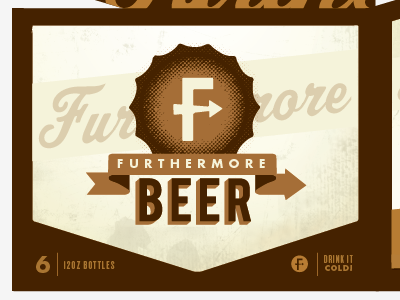
New FmB 6er opt2
EFg
Follow
Following
Like
#F5F3E1
#462300
#DDD0B2
#A66F35
#734A1E
#937553
#BA9264
#CBB18E
Download color palette
beer
design
furthermore
packaging
View all tags
Posted on May 6, 2012
476
0
30
7
View feedback
EFg
More by EFg
View profile
Previous
Next
Loading…