Love everything except the social buttons. Too much contrast with that lower Facebook signature highlight. Twitter glyph looks jagged, and I think the email glyph is a tad too sharp in the corners.
@Jeremy Sallée ✦✦✦ I remember a dialog about the Facebook login button a while ago, I must say it ended up looking great, very elegant that bottom stripe :) makes it feel lighter. Perhaps the Twitter, Email Glyphs and font I would add a bit more inner shadow? Perhaps only raising the distance from 0px to 1px (on inner shadow) would do the job, to inset the text/glyph a bit more?
The thing I love most is that the buttons are big enough for "big boys" fingers :)
I personally have very tiny and slim fingers but always care about how comfortable it would be for people to tap on the button. You certainly care too!
Very nice. I like your solution for multiple signups. I also had to do the same for an app that I'm working on. I like that you de-emphasized the other two option making it less busy. Well done!
26 Responses (page 1 of 2)
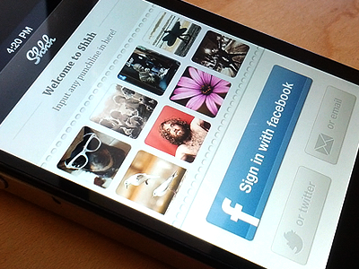
This is the login page of the app.
full design here
Yes I know. That Facebook button is massive compared to the rest. It is intended this way.
Pictures are all made by me, pretty convenient :)
about 1 year ago
Pro
Elliot
Nice Buttons!
about 1 year ago
Pro
Eric Hoffman
Looks nice, man!
about 1 year ago
@Eric Hoffman Thx dude, glad you like it!
about 1 year ago
@Elliot Thx mate, I like them too ;)
about 1 year ago
Pro
Matt Gentile
Very nice keeping it simple!
about 1 year ago
Pro
Sean Berlin
Love everything except the social buttons. Too much contrast with that lower Facebook signature highlight. Twitter glyph looks jagged, and I think the email glyph is a tad too sharp in the corners.
Nav bar is my favorite, though.
about 1 year ago
Pro
Ricardo Henriques
@Jeremy Sallée ✦✦✦ I remember a dialog about the Facebook login button a while ago, I must say it ended up looking great, very elegant that bottom stripe :) makes it feel lighter. Perhaps the Twitter, Email Glyphs and font I would add a bit more inner shadow? Perhaps only raising the distance from 0px to 1px (on inner shadow) would do the job, to inset the text/glyph a bit more?
about 1 year ago
Pro
Jeremiah Wingett
I really like the Facebook button and the stripe on the bottom. It's unique and different. Great job!
about 1 year ago
Pro
Christian Dalonzo
Not a fan of the twitter bird you're using, maybe use the official one? Other than that, this looks great, especially the navbar.
about 1 year ago
Excellent, comme d'habitude. La photo des mouettes est terrible :D
about 1 year ago
Pro
Gil
There's just sexyness all over the place
about 1 year ago
Pro
Oykun
love the colours! looks so soft!
about 1 year ago
Pro
George Gliddon
Awesome topbar texture!
about 1 year ago
Pro
Julia Khusainova
@Jeremy Sallée ✦✦✦ great job as always! Very detailed and crisp.
The thing I love most is that the buttons are big enough for "big boys" fingers :)
I personally have very tiny and slim fingers but always care about how comfortable it would be for people to tap on the button. You certainly care too!
about 1 year ago
Awesome!
about 1 year ago
honestly, you're creative on the design, but the name of the app is a bit ... not creative? haha
about 1 year ago
Pro
Bruno Felicio
nice!
about 1 year ago
Very nice. I like your solution for multiple signups. I also had to do the same for an app that I'm working on. I like that you de-emphasized the other two option making it less busy. Well done!
about 1 year ago
Pro
Nuruzzaman Sheikh
Love the work mate!
about 1 year ago
That is the most distorted Twitter bird ever.
about 1 year ago
Pro
Emmanuel Mourgue
Nice !
about 1 year ago
very nice :)
about 1 year ago
Pro
M khalid khan
I really like twitter and email buttons
about 1 year ago
Pro
M khalid khan
Can you please provide the PSD of twitter and email buttons? I want to see the shades and borders
12 months ago