Bill Organizer App

20 Responses

  1. Pro Umar Irshad Umar Irshad

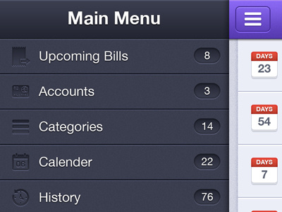
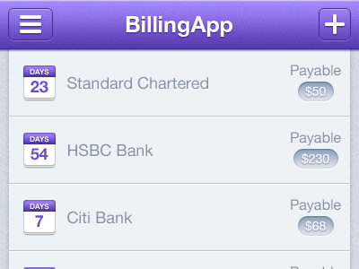
    A shot from an upcoming app I designed "Bill Organizer". Thought I'd share another screen from the app.

    about 1 year ago

  2. Pro Thom Thom

    bad crop, great design! :P

    likes

    about 1 year ago

  3. Pro Umar Irshad Umar Irshad

    @Thom haha, that was a quick downscale.

    likes

    about 1 year ago

  4. Pro Avinash Tripathi Avinash Tripathi

    bahut badiya Umar bhai.

    Just that the I am finding icons on the extreme left are little less on contrast? And accounts and upcoming bills icons are not in sync with the rest of the family!

    What say!

    likes

    about 1 year ago

  5. Rafał Krawczyk Rafał Krawczyk

    Looks like Facebook for iOS. ;]

    likes

    about 1 year ago

  6. Pro Umar Irshad Umar Irshad

    @Avinash Tripathi Agreed, but the had to go for those colors for icons because client wanted me to.

    @Rafał Krawczyk Yeah :P but I wasn't allowed to make much changes to his basic layout.

    likes

    about 1 year ago

  7. Ethan Kramer Ethan Kramer

    Great job! Just a few comments. I agree with @Rafał Krawczyk I personally, I think it should be more original (although, you are doing this for a client....). I also agree with @Avinash Tripathi about how the icons on the left need more contrast and that "...the upcoming bills icons icons are not in sync with the rest of the family...". Personally I think the icons on the left are too dark, they're hard to make out I would make the icons lighter and give them more contrast against the background

    likes

    about 1 year ago

  8. Jerett Patterson Jerett Patterson

    Stupid question but where did you get the icons? I have seen those but can't for the life of me remember the url.

    Other than that - this is looking tight.

    likes

    about 1 year ago

  9. Pro Umar Irshad Umar Irshad

    @Jerett Patterson Some icons are from my iconset Galaxicons and that credit card icon is from IconSweets 2 :)

    about 1 year ago

  10. Jerett Patterson Jerett Patterson

    Thats right - ugh - I actually have those purchased which is why they pop out so much. Thanks man!

    likes

    about 1 year ago

  11. Sergey Simanov Sergey Simanov

    love it!
    but why do designers have to follow the trend is not completely hiding the menu?

    Sorry for my english

    likes

    about 1 year ago

  12. Pro Dhiren Adesara Dhiren Adesara

    10 min before I join the party ! Great Work ! Sir !

    likes

    about 1 year ago

  13. Andrey S. Rodrigues ☝ Andrey S. Rodrigues ☝

    nice

    likes

    about 1 year ago

  14. Pro Eddie Lobanovskiy Eddie Lobanovskiy

    looks dope mate!

    about 1 year ago

  15. Pro Noe Araujo Noe Araujo

    purple rocks!!!!

    likes

    about 1 year ago

  16. Montydesi Montydesi

    man those gradients are so m*ther f*cking smooth!

    likes

    about 1 year ago

  17. Pro Ryan Ford Ryan Ford

    You spelled Calendar wrong.

    likes

    about 1 year ago

  18. Pro Umar Irshad Umar Irshad

    @Ryan Ford Haaa, you caught me :P

    about 1 year ago

  19. Pro Gert Tzafa Gert Tzafa

    Great colors here Umar! :)

    likes

    about 1 year ago

  20. Pro Gert van Duinen Gert van Duinen

    This is pretty neat too!

    likes

    about 1 year ago

keyboard shortcuts: previous shot next shot L or F like