Remake of Vimeo

Rebound

24 Responses

  1. Victor Erixon Victor Erixon

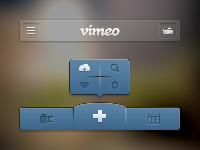
    Had to do a remake of Vimeo's current iPhone app. This is much like Path, press the + and extra a menu options pops up.

    What do you guys think?

    likes

    about 1 year ago

  2. Dennis Flinsenberg Dennis Flinsenberg

    Seems like it could be a pain to tap those 4 different icons. I believe Apple recommends their minimum hit area to be 40px. How big are these?

    likes

    about 1 year ago

  3. Victor Erixon Victor Erixon

    @Dennis Flinsenberg The icons are about 20-23px, and in retina they would be 40-46px. The tapping area is height: 34px & width: 60px in non-retina.

    about 1 year ago

  4. Al ☯ Power Al ☯ Power

    yeh, apple recommend 40pm (not retina) to be the button size. they use 44px as there standard on there iOS designs.

    likes

    about 1 year ago

  5. Alex Cican Alex Cican

    Well, instead of two rows, you could move the buttons in one row and problem solved. A bit too much shadow/inset for my taste

    likes

    about 1 year ago

  6. Robin Kylander Robin Kylander

    I really like this one Victor, but in my opinion the dark blue icons could get a little bit more darker and the newspaper could get less details.

    Good job :)

    likes

    about 1 year ago

  7. Victor Erixon Victor Erixon

    @Alex Cican
    @Robin Kylander
    @Al Power ✩ Thank you guys, I agree with all of you.

    about 1 year ago

  8. Max Rudberg Max Rudberg

    I think the purpose of the button is not clear. A plus to me means adding something. If it's meant to mean "more content", which this looks like, I think you should go with the "…".

    This also shares the problem that Path has with their fly out menu, it's not super obvious what the icons are and it might be hard for a novice user to understand them.

    That said, props for trying to innovate further around the standard iOS UI elements. 👍

    likes

    about 1 year ago

  9. Ethan Kramer Ethan Kramer

    Wow. Much better! Just make sure it is compliant with apple HIG

    likes

    about 1 year ago

  10. Victor Erixon Victor Erixon

    @Max Rudberg Thanks man, admire your work.
    @Ethan Kramer Agree, I will.

    likes

    about 1 year ago

  11. Ben Bate ⚒ Ben Bate ⚒

    Ye, agree with people's feedback. Looks absolutely brilliant though Victor. Excellent job ;)

    about 1 year ago

  12. McKay Thomas McKay Thomas

    what make's path's solution so wonderful is it's minimalism. They have removed all bottom chrome in exchange for a two step process. This has both chrome (a lot of it) and a two step process. I'd keep playing around with it. Love the icons, though! And the attention to visual detail.

    about 1 year ago

  13. Shad Romero Shad Romero

    Nicely done. Love the details. Great work! Cheers

    about 1 year ago

  14. Guillaume Gaubert Guillaume Gaubert

    I think the camera for the right tab bar button in the nav bar is too detailed, not simple enough.

    about 1 year ago

  15. Brian Beavers Brian Beavers

    Agree with some of the others. I love this, but I think the icons can be refined. Some are simple, but others are too detailed. I'd go with less is more. Love the shadows and blue hues.

    about 1 year ago

  16. Isaac Grant™ Isaac Grant™

    Really freshh!

    likes

    about 1 year ago

  17. Garrett Godsey Garrett Godsey

    Very pretty :)

    about 1 year ago

  18. Eddie Lobanovskiy Eddie Lobanovskiy

    dig it!

    likes

    about 1 year ago

  19. Josh Fabian Josh Fabian

    I'm in lust with this.

    about 1 year ago

  20. Nathan Walker Nathan Walker

    You know, I think everyone's being very very nitpicky here. It looks awesome, but I would tone down the divider between the 4 icons.

    about 1 year ago

  21. Robert Cooper Robert Cooper

    Nice work. One comment on the icons - they are very difficult to quickly read, especially the ones on the left and right. Need more contrast and maybe a new icon.

    likes

    about 1 year ago

  22. Andrey S. Rodrigues ☝ Andrey S. Rodrigues ☝

    really nice!

    likes

    about 1 year ago

  23. Funky Munky Creative Funky Munky Creative

    Nice, but I would not be "afraid" of the dividers, I would keep those all the way.
    -Squirrel Munky-

    likes

    about 1 year ago

  24. Victor Erixon Victor Erixon

    @Funky Munky Creative Thanks! I'm going to upload a full version soon in Retina.

    likes

    about 1 year ago

keyboard shortcuts: previous shot next shot L or F like