Rough draft of my teaching website

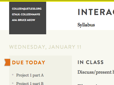

This is still really rough and many details need to be taken care of like lining up the flag next to "due today" but I like the fonts and the colors. I'm not happy with the contact information area at the top but am not sure what to do with it. Suggestions for this or other parts of the site? Should I move the navigation and type in the header to left align with the copy below (Wednesday, due today etc.) and put the contact info on the right?


