Weather Icon Set

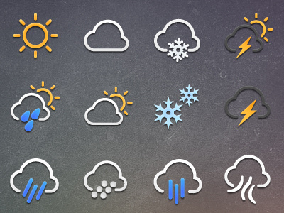
Made a few updates to my initial weather icon set last night. Still not sure about my initial raindrops trying out some alternatives, also added a possible icon for wind (see bottom row) Feedback appreciated...
Made a few updates to my initial weather icon set last night. Still not sure about my initial raindrops trying out some alternatives, also added a possible icon for wind (see bottom row) Feedback appreciated...


