TV Tak! im literally about to start on a new icon using there functionailty on our app! very strange coincidence! is this going to be there new design?
@Al Power ✩ yea its a redesign :) Amselem told me about you btw :D Cheers!
@Alexandre@Steve Lowtwait This icon is "to check all the tweets about selected post" i was running out of ideas so i put two dotes in it lol but client hated it as much as you guys did.
@Martin Fabricius i'm busy building the basic structure, once its done i can play with textures/colors. Thanks for the opinion.
26 Responses (page 1 of 2)
Pro
zee7 ✽
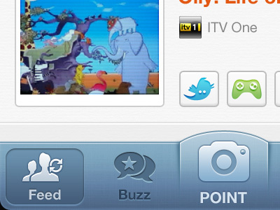
start of a new project. anything you'd like to suggest?
bigger-view
about 1 year ago
Pro
Jip
Looks sweet :)
about 1 year ago
Pro
Kerry Moran
I'm intrigued.... Also lovely work as always :)
about 1 year ago
TV Tak! im literally about to start on a new icon using there functionailty on our app! very strange coincidence! is this going to be there new design?
about 1 year ago
Pro
Daryl Ginn
Point area = sex.
Great work mate.
about 1 year ago
lovely bar
about 1 year ago
Pro
Haziq Mir
No capitals, please.
about 1 year ago
Pro
Alexandre Naud
Why there are two points on the Twitter icon ? But great, as usual.
about 1 year ago
Pro
Steve Lowtwait
Yeah, how come the Twitter bird has nipples?
Otherwise, it's all looking very sharp.
about 1 year ago
Pro
Kartik Mahant
The clock icon is placed 1 px or 2 px down.
about 1 year ago
Pro
Martin Fabricius
Dont like the texture in the navigation bare, but otherwise it's f****ing awesome! Great colors and shadowing!
about 1 year ago
Pro
Alex / Tapein
This is looking great so far :)
about 1 year ago
Pro
Avinash Tripathi
so good!
about 1 year ago
Pro
Daniel Vernon
This is great mate!
about 1 year ago
Pro
Trent McBride
Very very pretty. LOVE that whole 'POINT' area but agree that the caps are a little strange. Super sweet though...
about 1 year ago
AHHHH THESE TAB BAR ICONS!
about 1 year ago
Pro
Mani
you both damn coOl :)
about 1 year ago
Pro
Matt Gentile
sweet setup @zee7 ✽!
about 1 year ago
Pro
Tanveer Junayed
@zee7 ✽ :: Looking great bro. It's kinda similar style of you previous app?
about 1 year ago
@zee7 ✽ love the colour treatment on the nav bar :)
about 1 year ago
Pro
Nuruzzaman Sheikh
@zee7 ✽ lovely work bro!
about 1 year ago
This is awesome work! Love how you make icons so clean. Great work @zee7
about 1 year ago
@zee7 ✽ Loved the tabbar style and shadowing.. ! o_O
about 1 year ago
Pro
zee7 ✽
@Al Power ✩ yea its a redesign :) Amselem told me about you btw :D Cheers!
@Alexandre @Steve Lowtwait This icon is "to check all the tweets about selected post" i was running out of ideas so i put two dotes in it lol but client hated it as much as you guys did.
@Martin Fabricius i'm busy building the basic structure, once its done i can play with textures/colors. Thanks for the opinion.
@Trent McBride @Haziq Mir Changed.
@Tanveer Junayed ;)
about 1 year ago
Rebound
tvtak
by zee7 ✽
This is the most important page of tvtak app. So we tried pretty much everything and set on this color/ux.
All the color options are attached. I would love to know your choice.
♪♫ ♪♫ ♪♫ you should check this ♫♪♫ ♪♫
about 1 year ago