Mattrunks vector

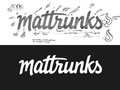
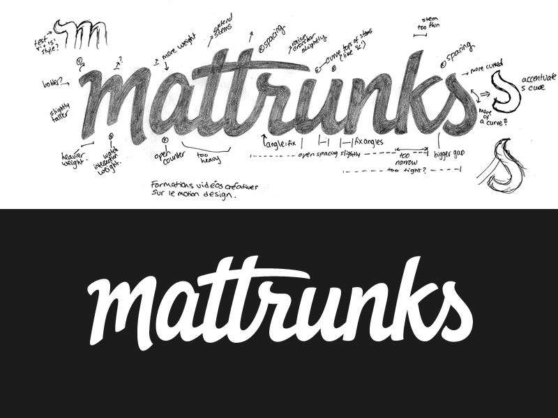
Final filled in sketch with notes for revisions and vector version. Many thanks to everyone for the feedback on the previous shot, it was really helpful! I tested an alternate initial stroke on the 'm' to mirror the top of 'r' and 's', but it looked a bit evil. I also tried curving the top of the 'u' stems like the ones on 't' and 'k' but it looked out of place and a little unnatural. I still have a day or so to finalise the details, so open to suggestions on anything that could need fixing.


